40% off
Applique Embroidery Font Bundle
PES · DST · JEF · EXP · HUS · VP3 · XXX · BX
Every font is 40% off. Two fonts are 45% off. Three or more are 50% off.
Lettering
Home / Guides & Tutorials · By Fontstitch · November 5, 2026
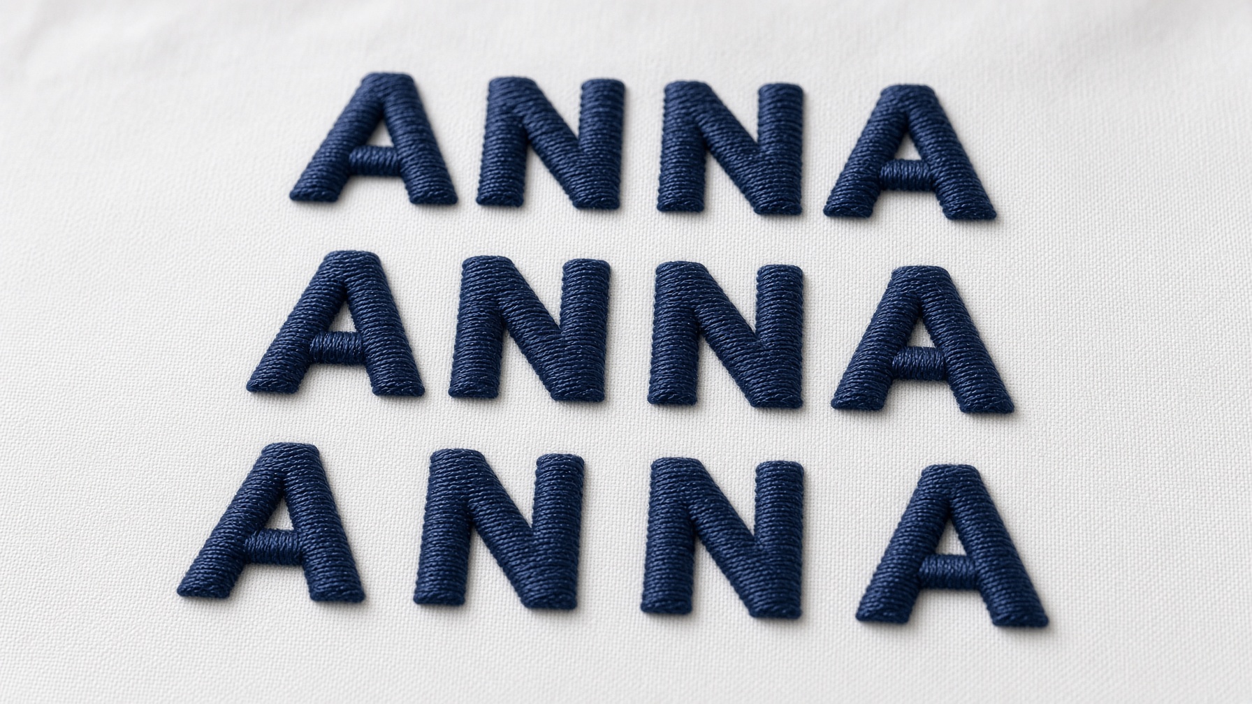
Machine embroidery lettering is about more than choosing an attractive font. A beautiful alphabet and the right stitch settings can still look unfinished if the letters are not spaced well.
A name can look even on the screen and uneven after it is stitched. Some letters sit too close, others look disconnected, and the word no longer reads as one line. Those problems are usually letter spacing, also called tracking, and kerning.
In embroidery the letters are thread, not ink. Thread thickness, stitch density, fabric movement, and the shape of each character all change how much room a pair needs. A few habits make the result much cleaner.
This guide covers how spacing works, how to spot the usual problems, how to move individual letters, and how the same word behaves on different fabrics. Height is a separate decision. Use the embroidery font size guide before you lock the letter height.
Letter spacing is the room between characters in a word or a line of embroidered text.
The aim is not an identical measured gap between every character. The aim is a word that looks balanced. A capital A is pointed at the top and wide at the base. An O is round. An L is a vertical stroke and a short foot. Software can place every character on the same interval and the word can still look uneven.
The two words are often swapped, but they are different adjustments. Letter spacing, or tracking, is the distance across the whole word. More tracking makes the word wider. Less tracking pulls the characters together.
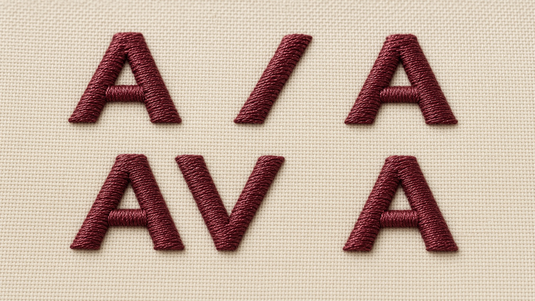
Kerning is the space between one pair. AV, WA, TA, and YO often need their own nudge because the shapes leave a larger visual hole. Automatic kerning helps. A few pairs still need a hand adjustment.
Printed type is a solid shape. Embroidered type is thread and needle holes, so the same gap can look different once it is stitched.
Very small letters make a tight gap worse. The checks in how to embroider small letters belong next to this one when the text is short.
The same tracking setting applies to the whole word. It is a good start for names, short words on shirts and jackets, straight lines, and simple block fonts. Begin with the font’s own spacing, then open or close the word until it looks even. Uniform spacing is not always the last step, because pairs are not the same shape.
Move one character closer to its neighbor, or farther away. This is the fix for AV, WA, TA, LT, YO, and FA. Those shapes leave a hole that the rest of the word does not have. Correct the pair. Do not restretch the whole name for one gap.
This is the vertical distance between lines, such as a first name over a last name. Too close and the lines collide. Too far and they stop looking like one design. The right distance depends on the letter height, the style, and the space in the hoop.
The buttons differ by program. The order does not.
Embrilliance is the practical place to type a BX font and arrange a name. Enter the text, pick the font and the size, then look at the gaps. Depending on the lettering object, you can change the overall spacing or move one character.
The everyday steps for the program are in the Embrilliance Essentials beginner guide. Installing the BX file first is covered in how to install a BX font.
Wilcom documents the same idea for its own lettering tools: overall spacing, then individual characters, in the letter spacing help. BERNINA’s embroidery software quick start is another place to see how a lettering object is edited. The controls you see depend on the software version, and on whether you are editing live lettering or a file that has already been turned into stitches.
There is no single spacing number for every alphabet.
Do not copy one number onto every job. Use this as a place to begin, then test.
| Project | Spacing approach | Main consideration |
|---|---|---|
| Small shirt names | Balanced, slightly open when needed | Readability |
| Large jacket lettering | Consistent visual gaps | Overall proportions |
| Towels | Clear separation | Fabric pile |
| Sports jerseys | Compact but readable | Available width |
| Script monograms | Preserve connections | Natural letter flow |
| Varsity lettering | Allow room for outlines | Complete letter width |
| Multiple-line designs | Consistent horizontal and vertical spacing | Visual alignment |
For small lettering, the screen is not enough. Thread and fabric movement change the result. More on that is in the embroidery font size guide.
Use fabric like the real item, and the same font, thread, stabilizer, and letter height. Stitch two or three versions of the word with slightly different spacing. Then look at whether the letters stay separate, whether the word reads from a normal distance, whether the shapes hold, whether the fabric stays flat, and whether script joins or outlines are still intact.
Keep a note of the combinations that worked. That list is more useful than a single spacing number.
After the spacing looks right, save the file your machine reads. Brother and Baby Lock use PES, Janome uses JEF, and Singer uses XXX. The list is in which file your machine uses.
Spacing is a small setting with a large effect. A strong alphabet does not finish the job by itself. The shapes, the gaps, the stitches, and the fabric all show in the result.
Start with a font that fits the job, use a listed size, set the tracking, and correct only the pairs that still look wrong. Judge the whole word, not one letter at a time.
Browse the embroidery fonts for block, script, varsity, and appliqué lettering. Related reading: embroidery font size guide · how to embroider small letters · Embrilliance Essentials beginner guide
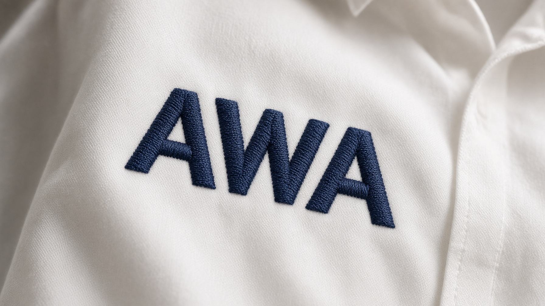
Tracking adjusts the general spacing between characters across a word. Kerning corrects the distance between specific pairs of letters.
Uneven lettering can come from inconsistent spacing, the shapes of the letters, fabric movement, or alignment. Review the whole word and move only the pairs that look wrong.
Not always. Equal numbers do not always look equal. Some pairs, such as AV or WA, need their own adjustment.
Yes. You can change the spacing of a lettering object and move individual characters. The controls depend on the object and the software version.
Yes. A connected script depends on the joins. Too much space pulls the letters apart and the word stops looking handwritten.
Yes. The same gap looks different when the letters are taller or the stitches are heavier. Judge the word at the size you will stitch.
Look at the whole word in the preview, check awkward pairs, then stitch a sample on similar fabric when the project matters.
PES · DST · JEF · EXP · HUS · VP3 · XXX · BX

BX · PES · DST · JEF · EXP · HUS · VP3 · XXX

BX · PES · DST · JEF · EXP · HUS · VP3 · XXX

PES · DST · JEF · EXP · HUS · VP3 · XXX · BX

PES · DST · JEF · EXP · HUS · VP3 · XXX · BX

PES · DST · JEF · EXP · HUS · VP3 · XXX · BX


