40% off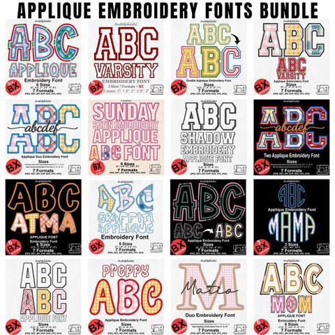
Applique Embroidery Font Bundle
PES · DST · JEF · EXP · HUS · VP3 · XXX · BX
Every font is 40% off. Two fonts are 45% off. Three or more are 50% off.
Lettering
Home / Guides & Tutorials · By Fontstitch · October 29, 2026
A clear font can still disappoint if the letters are too small for the fabric, too crowded for the word, or built for a different job. Size is the height of the letters, the width of the strokes, the stitch style, and the surface together.
This guide is about choosing a letter height before you stitch: a short name, a varsity word, or a large monogram. The ranges below are starting points, not a minimum that every font can hold. For very small text, thread, and needles, use the separate guide on small letters that stay readable.
Decide what the finished lettering has to do before you browse alphabets.
A short name on a smooth shirt can stay modest. A varsity word on a sweatshirt needs enough height for the border and the inside of the letters to stay separate. Measure the space, then open the sizes listed on the font. A playful alphabet such as Playful And Quirky Hand-Drawn is listed from 0.75 inch. That is a different job from a 2-inch narrow varsity letter.
Capital letter height, or cap height, is the height of the capitals. It is not always the height of the whole design. Lowercase letters, ascenders, descenders, and swashes change the total size.
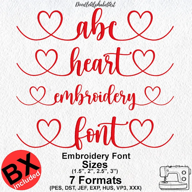
In the name Emma, the capital E can set the reference height while the other letters are shorter. A script can throw a loop above or below that line. Compare fonts by the stitched capitals, not only by the number on the screen. The Heart Monogram Satin Script guide shows how a long heart stroke sits outside the letters.
Use this table to plan. It is not a guaranteed minimum for every embroidery font.
| Project | Suggested capital height | Main consideration |
|---|---|---|
| Small names on clothing | 6–10 mm (0.24–0.39 in) | Simple, clearly defined lettering |
| Polo shirts and chest names | 8–15 mm (0.31–0.59 in) | Readability and fabric stability |
| Sweatshirts and casual wear | 10–20 mm (0.39–0.79 in) | Fabric thickness and placement |
| Towels and bathrobes | 12–25 mm (0.47–0.98 in) | Towel pile can hide small details |
| Caps and hats | 10–20 mm (0.39–0.79 in) | Curved surface and limited space |
| Large jacket lettering | 25–50 mm (0.98–1.97 in) or more | Visibility from a distance |
| Decorative monograms | 35–60 mm (1.38–2.36 in) or more | Ornament and the space around it |
A bold font may stay readable smaller than a fine script. A font digitized for small lettering will not behave like one made for a large monogram. The right size is the one that stitches cleanly on your fabric.
Chest lettering is often meant to stay quiet. Measure the space and the width of the finished name. For a short name, a capital height around 8–12 mm is a useful first test. A long name may need a narrower font rather than a smaller one.
Do not crush a detailed script just to fit a long name. A simpler font is often cleaner. On stretch fabric, stabilize it and stitch a scrap before the shirt.
There is more room for a team name or initials, but the fabric can be thick, stretchy, or brushed. Leave space between seams and pockets. If the font has an outline, a shadow, or an applique border, those parts need room to stay separate.
The stitches have to sit above the loops. Very small letters and fine script can disappear into the pile. For names and monograms, start around 12–20 mm of capital height, then test on a similar towel. A topping and a suitable stabilizer can help. More on pile fabric is in the small-letter guide.
The front panel is curved and short. A line that looks fine on a flat screen can be too wide or too tall for the cap. Simple block letters often suit a short name or initials. Check a dense varsity font against the real panel before you shrink it. Shrinking the whole design can close the gaps in the borders.
A large size is where a script, an initial, or a varsity letter can show its shape. Leave space around the edges so a heart stroke does not hit a seam. The Heart Monogram Satin Script is listed from 1.5 inches. How to type the first letter, the middle, and the last letter is in the heart script guide. Stitch the whole design at the intended size before the final piece. A word that is longer than the hoop is covered in stitching big words on a small hoop.
The same capital height can still stitch very differently. Stroke width, spacing, curves, and stitch direction decide what survives.
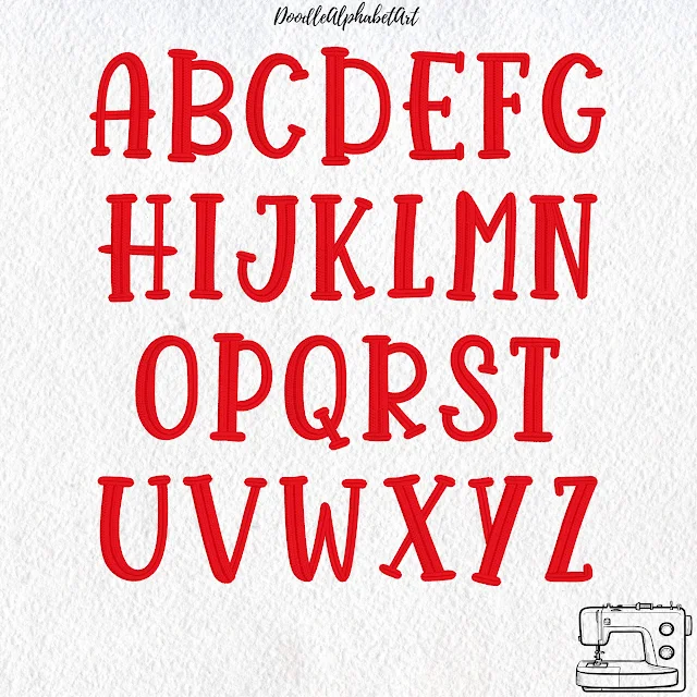
Thick, simple shapes are a practical choice for names and uniforms. Open spaces stay recognizable when the font was digitized for that scale. Playful And Quirky is one of those. A satin column is different: the thread has to cross a wide enough shape, which is why a satin column college font starts at 1 inch, not at a tiny size.
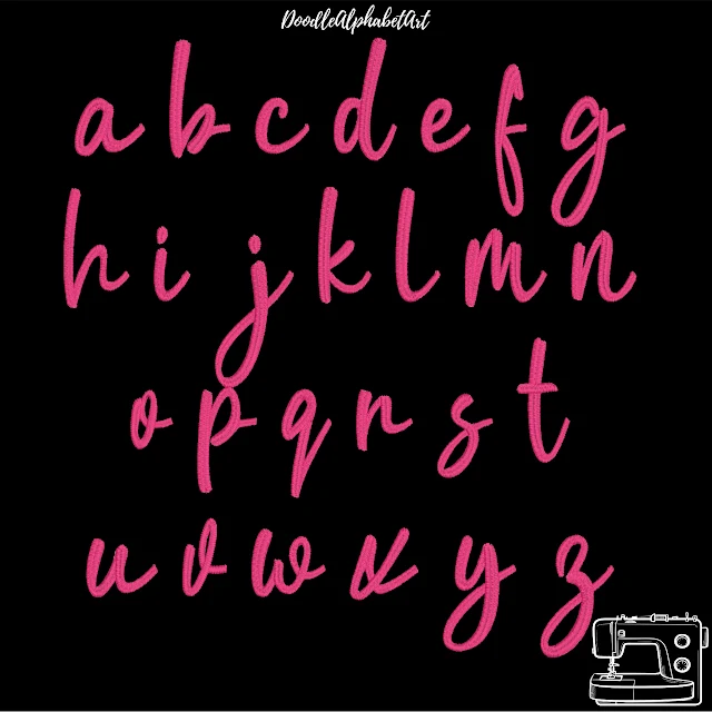
Joins, loops, and thin strokes are what make a script look written. They are also what disappear first. Look at the lowercase letters and the gaps between joins. A script that looks right large may need much more room than a block font. Handwriting Script includes a full lowercase alphabet and is listed from 0.75 inch. A connected baseball stroke is typed differently. That is covered in the Baseball Lobster stroke guide.
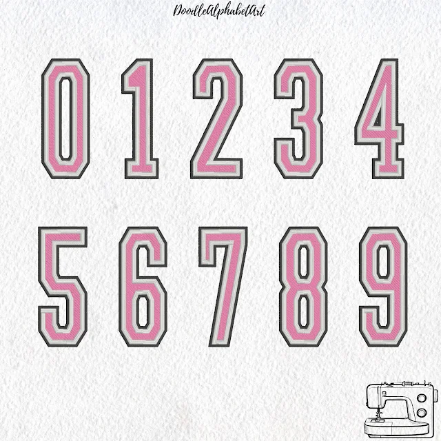
Outlines, extra colors, and a fabric fill need width of their own. For applique, the letter has to hold the fabric, the tack-down, and the border. Shrinking a large applique alphabet can throw those parts off. Use a size the font already includes. The stitch order is in how to stitch an applique font. Numbers on a jersey often need more height than a chest name. These are from the Narrow Varsity 3-Color set, listed from 2 inches.
There is no single minimum for machine embroidery lettering.
A clean, bold font may be worth a test around 6–8 mm of capital height. A fine script, a small serif, or a decorative alphabet often needs more. Look at the narrowest part of the real letters: the main strokes, the openings in A, B, O, and R, the joins, and whether the fabric will hold the detail.
If any of that is uncertain, stitch a sample. For very small text, a font made for that size is a better start than shrinking a regular alphabet. The practical checks are in how to embroider small letters.
Letter height is only one part. The surface changes how clearly the stitches show.
| Fabric | What to consider |
|---|---|
| Smooth woven cotton | A useful surface for a first test. |
| Stretch jersey | Stabilizer matters, or the letters move. |
| Piqué polo | The texture can soften small details. |
| Terry towels | The loops can hide stitches. A topping may help. |
| Fleece | The pile can cover fine strokes and joins. |
| Denim or twill | Often suits bold lettering, depending on thickness. |
The same font can look clear on one garment and muddy on another. Match the stabilizer, needle, and thread to that fabric, then judge a sample on similar material.
Note the size and the fabric when a test works. That note saves time on the next similar job.
After the size is roughly decided, use a file your machine can read. A BX font is typed in Embrilliance, which is useful when you personalize names often. The steps are in how to install a BX font. What the free mode leaves out is in the Embrilliance Essentials guide. Individual stitch files may be PES, DST, JEF, EXP, HUS, VP3, or XXX, and only when that font includes them. See which file your machine uses and the formats page.
A set of sizes that were digitized one by one is more useful than one design you shrink freely. Before you buy, read the sizes, the characters, and the formats on that font page.
Browse the embroidery fonts and check the listed heights. A block for a small name, a varsity alphabet for a team word, or a script for a monogram each belong at the size that font was built for.
For many chest names, 8–12 mm of capital height is a useful first test. The right size still depends on the font, the length of the word, the fabric, and the space on the garment.
Some fonts can. Many cannot. Very small lettering needs a design built for that height. Test that font on similar fabric before the finished item.
Lowercase letters are usually shorter than the capitals. Some also have narrow strokes and small enclosed spaces, which are harder to keep open.
It can be, if the columns were digitized for that size. A column that is too narrow loses its shape. Check the sizes listed for the font, then stitch a sample.
Often, yes. Towel loops can cover fine detail, so clearer, larger letters usually read better. Test the pile, the font, and the stabilizer together.
You can resize a design in Embrilliance. That does not rebuild the stitches. Type a BX font at one of its listed sizes instead of shrinking a finished stitch file a long way.
Start with a simple, clearly defined font. A bold block often holds up. A delicate script or a layered varsity alphabet usually needs more room.
PES · DST · JEF · EXP · HUS · VP3 · XXX · BX

BX · PES · DST · JEF · EXP · HUS · VP3 · XXX

BX · PES · DST · JEF · EXP · HUS · VP3 · XXX

PES · DST · JEF · EXP · HUS · VP3 · XXX · BX

PES · DST · JEF · EXP · HUS · VP3 · XXX · BX

PES · DST · JEF · EXP · HUS · VP3 · XXX · BX


